Plotting and Data Visualization
Overview
Teaching: 20 min
Exercises: 20 minQuestions
How do I visualize data by making graphs?
Objectives
Plot data to visualize results.
Label plot axes and create a figure legend.
Plot multiple graphs on one figure.
Save figures to files.
One of the most common ways to present scientific data is through graphs or plots.
Prepare for plotting
From the previous lesson, remember that you should hav a variable called
datadefined which contains the tabular data indistance_data_headers.csv. If you do not have this stored in yourdatavariable, here is how to load it.import os import numpy distance_file = os.path.join('data', 'distance_data_headers.csv') distances = numpy.genfromtxt(fname=distance_file, delimiter=',', dtype='unicode') headers = distances[0] data = distances[1:] data = data.astype(numpy.float)
Plotting Data
Another common way to analyze tabular data is to graph it. To graph our data, we will need a new python library that contains functions to plot data. To plot our data, we will use a Python library called matplotlib.
import matplotlib.pyplot
matplotlib.pyplot.figure()     #This initializes a new figure
matplotlib.pyplot.plot(data[:,1])

matplotlib.pyplot is a lot to type every time we make a plot. Often, when people import python modules they give them a shorthand name so that they have to type less. For example, matplotlib.pyplot is commonly shortened to plt. You’ll see this in official documentation for matplotlib. Let’s change our code so we don’t have to type this every time.
import matplotlib.pyplot as plt

plt.figure()
plt.plot(data[:,1])
Labeling plots and saving figures
But what information is our plot showing? We should label our axes and add a legend that tells us which sample this is. We can add x and y labels using the xlabel and ylabel functions. To add a label so we can use a legend on the plot, we add the label keyword to the plot function. We may also want to save our plot as an image so we can use it outside of this notebook. To do this, we use the savefig function.
sample = headers[1]

plt.figure()
plt.xlabel('Simulation Frame')
plt.ylabel('Distance (angstrom)')
fig_1 = plt.plot(data[:,1], label=sample)
plt.legend()

plt.savefig(F'{sample}.png')

After executing this code, check the directory you are working in. You should have an image called THR4_ATP.png that looks like the one displayed above and in your notebook.
Increasing image resolution
Often, when you preparing images for your research, you will want to increase the image quality or resolution. This is easy to do with the savefig command we have been using. To increase the resolution your image is saved as, add the command ‘dpi=NUMBER’ to the savefig command. dpi stands for “dots per inch”, and 300 is a resolution that is commonly used for publications.
sample = headers[1]

plt.figure()
plt.xlabel('Simulation Frame')
plt.ylabel('Distance (angstrom)')
fig_1 = plt.plot(data[:,1], label=sample)
plt.legend()

plt.savefig(F'{sample}.png', dpi=300)
Now, when you check your image, it should be much higher quality. One downside of increasing image resolution is that your figures will take longer to save. If you are making a lot of plots to quickly look at data, you will probably not want a high image resolution. You will probably only want to increase the image resolution when you know you want to use the plot.
Plotting more than one set of data
To plot more than one data set on the same graph, we just add another plot command.
plt.figure()
plt.xlabel('Simulation Frame')
plt.ylabel('Distance (angstrom)')
plt.plot(data[:,1], label=headers[1])
plt.plot(data[:,2], label=headers[2])
plt.legend()
plt.savefig('two_samples.png')

If we want to plot all samples on the same plot, we can use a for loop to loop through all the columns. Here, we put the x and y labels and savefig command outside of the for loop since those things only need to be done once.
for col in range(1, len(headers)):
    fig = plt.plot(data[:,col], label=headers[col])
    plt.legend()

plt.xlabel('Simulation Frame')
plt.ylabel('Distance (angstrom)')
plt.savefig('all_samples.png')

Exercise
How would you make a different plot for each sample? Save each image with the filename
sample_name.png.Solution
To make a different plot for each sample, move the
plt.figure()and theplt.savefigcommands inside theforloop.for col in range(1, len(headers): plt.figure() sample = headers[col] plt.plot(data[:,col], label=sample) plt.legend() plt.xlabel('Simulation Frame') plt.ylabel('Distance (angstrom)') plt.savefig(F'{sample}.png')
Normalizing your axes across plots
For the plots showing our data so far, the y axis limits have all been different. Since these data sets are related, you may want to have all of the plots show the same axis ranges. We can manually set the y axis range of an axis for a plot using the command
plt.ylim(low_limit, high_limit)
where low_limit and high_limit are the lowest number we want on our y axis and the highest number we want on our y axis respectively.
Check your understanding
Take a minute to think - for our example what would be a good lower limit and higher limit for our plots? Do you have any idea of how we could calculate these values?
Solution
One good choice for lower and higher limits might be the minimum and maximum distance encountered in our data.
We can calculate these for our datasets using
data_min = numpy.min(data[:, 1:])
data_max = numpy.max(data[:, 1:])
Using the solution to the previous exercise, we can make the plots all have the same y axis range. You might consider scaling your minimum and maximum as well to give your data some breathing room.
data_min = numpy.min(data[:,1:])*0.9
data_max = numpy.max(data[:,1:])*1.1

for col in range(1, len(headers)):
    plt.figure()
    sample = headers[col]

    plt.plot(data[:,col], label=sample)
    plt.ylim(data_min, data_max)
    plt.legend()
    plt.xlabel('Simulation Frame')
    plt.ylabel('Distance (angstrom)')

    plt.savefig(F'{sample}.png')
Plotting with x and y
The plot function creates a line plot. If there is only one argument in the function, it will use that as as the y variable, with the x variable just being a count.
If we wanted to use the Frame column for our x value, we would add it as the first argument of the plot function. This won’t change the graph at all.
plt.figure()
plt.plot(data[:,0], data[:,1])
However, if we did not want to plot every frame, or if the data we were plotting was not sequential, we would have to specify x and y.
Let’s try plotting every 100th frame. To do this we will use a new slicing syntax. To select frames at regular intervals, we can use the syntax array[start:stop:interval].
For example, to get every other row to the 10th row, we would use a start of 0, and end of 10, and an increment of 2. We then use the : to get every column.
print(data[0:10:2, :])
array([[ 1.    ,  8.9542,  5.8024, 11.5478,  9.9557],
       [ 3.    ,  9.0066,  6.0637, 13.0924, 11.3043],
       [ 5.    ,  9.1294,  5.9365, 13.5321, 10.6279],
       [ 7.    ,  8.8657,  5.9186, 12.9312, 10.2176],
       [ 9.    ,  9.4184,  6.1993, 13.2614, 10.366 ]])
If you want to go to the end, leave out the end variable, and just use two colons ::.
Check your understanding
How would you get every 100th point in the first column?
Answer
incr_100 = data[0::100, 0]We have used a
startof 0,endto the end of the array, and anincrementof100. We then got just the first column (column 0 - counting starts at 0!)
Let’s make a plot with every 100 points.
plt.figure()
plt.plot(data[0::100,0], data[0::100,1])

Customizing plot appearance
We can change the marker or line type by adding another argument after our x and y values. For example, we can make our line dashed by adding '--'.
plt.figure()
plt.plot(data[0::100,0], data[0::100,1], '--')

Change the line to a marker
plt.figure()
plt.plot(data[0::100,0], data[0::100,1], 'o')

Or even combine effects.
plt.figure()
plt.plot(data[0::100,0], data[0::100,1], '--o')

Here is a list of options you can use.
character	description
'-'	solid line style
'--'	dashed line style
'-.'	dash-dot line style
':'	dotted line style
'.'	point marker
','	pixel marker
'o'	circle marker
'v'	triangle_down marker
'^'	triangle_up marker
'<'	triangle_left marker
'>'	triangle_right marker
'1'	tri_down marker
'2'	tri_up marker
'3'	tri_left marker
'4'	tri_right marker
's'	square marker
'p'	pentagon marker
'*'	star marker
'h'	hexagon1 marker
'H'	hexagon2 marker
'+'	plus marker
'x'	x marker
'D'	diamond marker
'd'	thin_diamond marker
'|'	vline marker
'_'	hline marker
You can also change the color using these options.
character	color
‘b’	blue
‘g’	green
‘r’	red
‘c’	cyan
‘m’	magenta
‘y’	yellow
‘k’	black
‘w’	white
Check your understanding
Modify your plot so that you have a black dashed line and circular markers.
Solution
plt.figure()
plt.plot(data[0::100,0], data[0::100,1], ':ok')
Here we have used
:ok.:tells matplotlib we want a dashed line,otells matplotlib we want circular markers, andksays we want the color to be black.
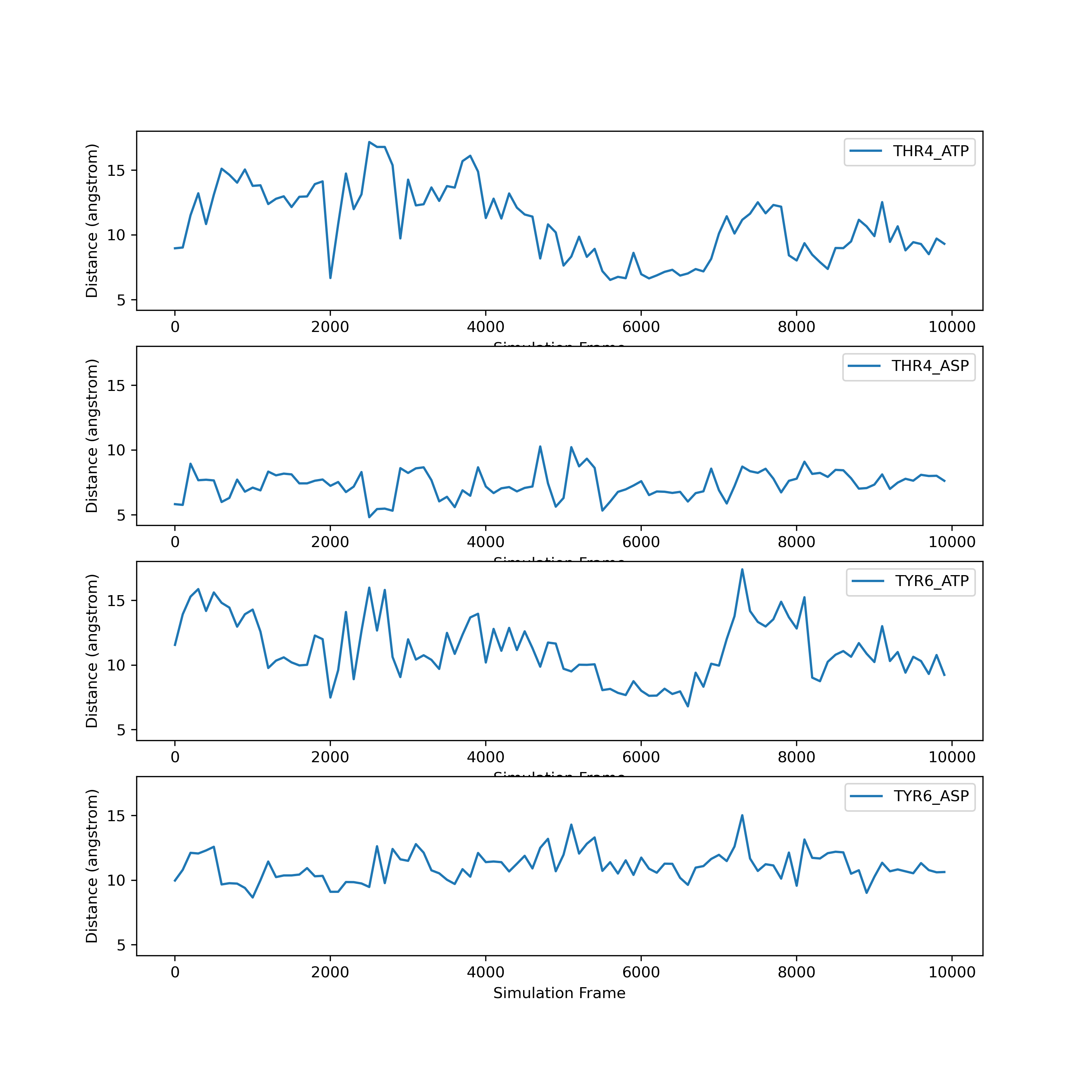
Multiple Plots with Subplot
Instead of making multiple different figures with your plots, you might want to make one figure which has many plots. Matplotlib’s answer to this is subplots. To create a figure which has several plots, you use the syntax
fig, ax = plt.subplots(nrows, ncolumns)
Subplot allows for you to lay plots out on a grid. You specify the number of rows and columns you want in your grid when you start.
Let’s create a subplot figure for our data:
fig, ax = plt.subplots(len(headers)-1, 1)
This should show four empty plots which are all part of the same figure. We have two variables which resulted from this function fig and ax. Fig is our figure, while ax is a numpy array that represents our figure axes. The shape of this array will be dependent on the shape we specify that we want our subplots.
ax.shape
(4,)
fig2, ax2 = plt.subplots(2,2)
ax2.shape
(2,2)
When we want to add data to our plots, we using the same slicing syntax we used with numpy arrays. For example, on ax, we can add data to the first row:
ax[0].plot(data[0::100,0], data[0::100,col])
fig
The fig command on the second line allows us to see our updated plot.
If we wanted to plot the same data on fig2, we would do
ax2[0,0].plot(data[0::100,0], data[0::100,col])
fig2
Check your understanding
How could you use a
forloop to add all of your data tofig?Solution
fig, ax = plt.subplots(len(headers)-1, 1)

for col in range(1, len(headers)):
    sample = headers[col]

    ax[col-1].plot(data[0::100,0], data[0::100,col], label=sample)
    ax[col-1].set_xlabel('Simulation Frame')
    ax[col-1].set_ylabel('Distance (angstrom)')
    ax[col-1].legend()
Improving the figure
Let’s make this look a little nicer. We probably want the figure to be a little bigger. We can add another argument figsize to our subplot command. You specify the desired figure width and height in inches (it will not appear this size on your screen, but this will be the size when you save the figure).
Finally, you might want all of the y-axes to have the same limits. With subplots, we can achieve this by adding another argument sharey=True to make all the y axes the same (you can also do this with sharex, but we don’t need to).
fig, ax = plt.subplots(len(headers)-1, 1, figsize=(10, 10), sharey=True)
#fig.set_figheight(10)

for col in range(1, len(headers)):
    sample = headers[col]

    ax[col-1].plot(data[0::100,0], data[0::100,col], label=sample)
    ax[col-1].set_xlabel('Simulation Frame')
    ax[col-1].set_ylabel('Distance (angstrom)')
    ax[col-1].legend()
Matpotlib is highly customizable. What we’ve shown here is only the beginning of the types of plots you can make. If you would like to make more plots, we strongly recommend you check out the matplotlib tutorials online.
Key Points
The
matplotliblibrary is the most commonly used plotting library.You can import libraries with shorthand names.
You can save a figure with the
savefigcommand.Matplotlib is highly customizable. You can change the style of your plot, and there are many kinds of plots.